A style is a system, not a filter
A useful illustration direction defines how characters are shaped, how backgrounds are simplified, how color behaves, how texture is applied, how light works, and how much detail belongs in a scene. Those decisions must survive across quiet pages, action scenes, close-ups, changing locations, and the cover.
A beautiful single image is not enough. Before choosing a direction, test whether the same character can remain recognizable from the front, side, and back; in several expressions; at different scales; and beside the book’s other recurring characters.
Six questions for choosing a direction
- Who is the intended reader? Younger readers may benefit from clearer silhouettes and fewer competing details.
- What should the book feel like? Tender, comic, adventurous, mysterious, educational, or energetic stories need different visual rhythms.
- What must be instantly readable? Character expressions, key props, and story actions should remain clear at the printed page size.
- Can the look stay consistent? The direction must work across the complete page plan, not only on the cover.
- What is the book’s shape? A wide scene, square composition, and portrait page create different opportunities and constraints.
- What does the approved scope support? More characters, locations, tiny objects, and intricate surfaces increase production complexity.
Character continuity matters more than novelty
Lock the features a reader will use to identify the character: body proportions, silhouette, face placement, color palette, markings, clothing, and signature props. Then test poses and expressions before committing to the complete book.
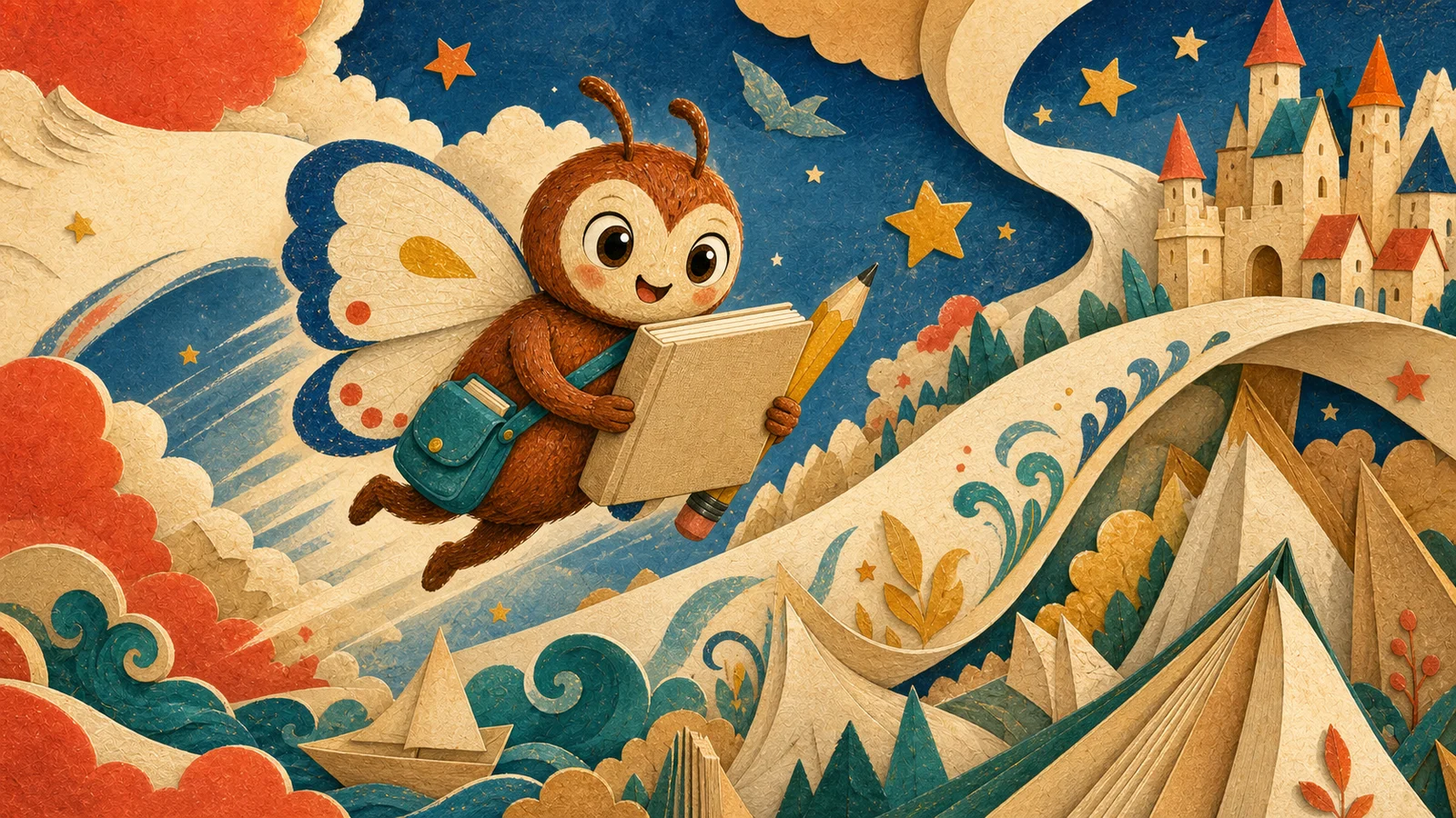
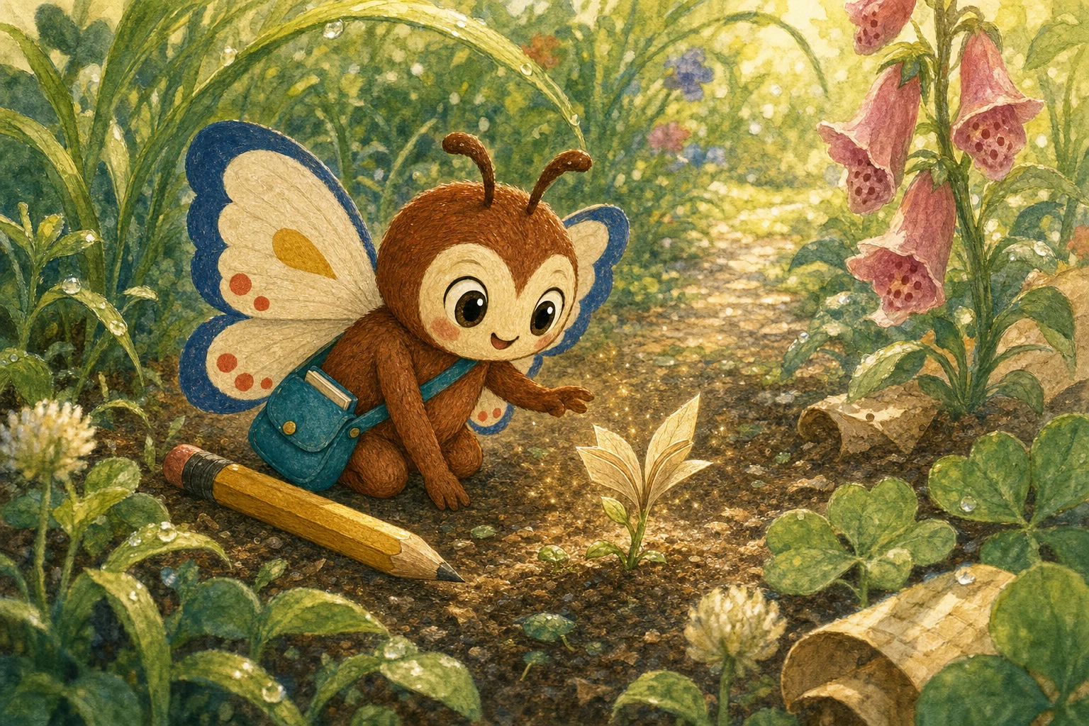
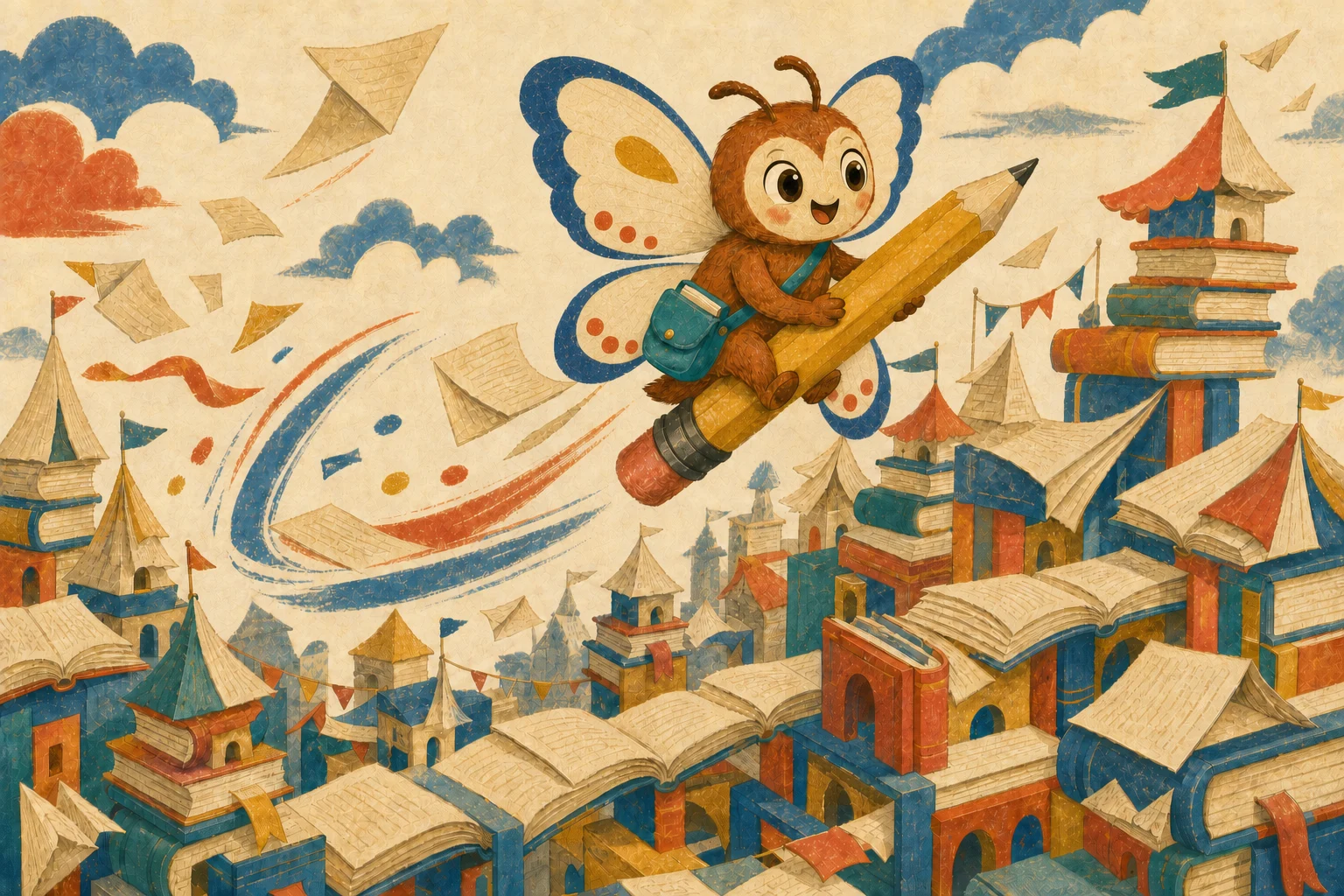
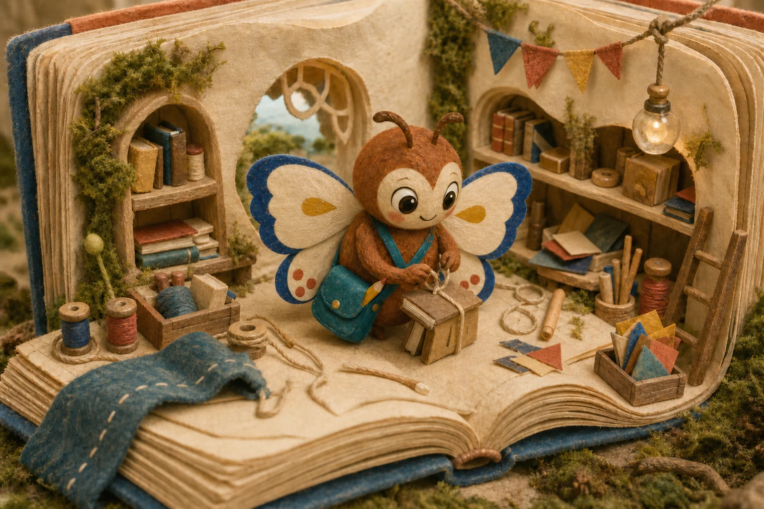
For Pip, the russet body, cream face, indigo-edged wings, coral dots, teal satchel, and gold pencil stay recognizable even when the surface treatment changes. The material language changes; the character identity does not. Use the 32-page character-consistency guide and checklist to turn those decisions into a repeatable production system.
Test a real scene before approving the style
A useful sample direction should apply the proposed look to material from the actual book. It should help answer:
- Does the character match the intended age and tone?
- Can the text remain readable around the composition?
- Does the palette support the scene’s emotional purpose?
- Are essential props and story actions clear?
- Can the same rules be repeated across the remaining pages?
Requesting a direction is not the same as commissioning the whole book. MyBookIllustrator offers a free sample direction before the standard package is confirmed.
What to include in the visual brief
Send the final, proofread manuscript, intended reader, planned page count, preferred trim shape, essential character facts, visual references, and a short note explaining what you like about each reference. Separate required details from optional ideas. The picture-book manuscript checklist provides a copyable brief.
Then compare the visual direction alongside the page-count plan and the square, portrait, and landscape examples in the picture book dimensions guide. Style, composition, and format should be approved as one coordinated system.
Ask how the images are made
Before approving any illustrator or studio, ask which parts of the process are hand-created, AI-generated, AI-assisted, licensed, composited, or edited. Make sure the written agreement explains the delivered files and practical publishing permission without promising rights that may not legally exist in every element or jurisdiction.
MyBookIllustrator’s standard package uses an openly disclosed artist-directed AI or AI-assisted process. Traditional or completely non-AI illustration is separately quoted.